The Situation: Opportunity Assessment How do we create more consistency and clarity for customers across the site?

The challenge
The purpose of this study was to generate design opportunities for Global Navigation aka a navigation menu that appeared on every page of the site.
The issue is: there are multiple lines of business, and they each have their own existing navigation menus. Because of the political nature of this project, a mindful and strategic approach was necessary in order to move forward with design recommendations. Without changes, customers may experience confusion, frustration, and decide the workarounds are not worth continuing to do business with this company.
As a result, the goal was:
#1 To understand visitors' needs, aspirations, and struggles when navigating the Public site.
#2 To investigate each line of businessʻ needs and concerns.
#3 To provide research recommendations that align within a very political project

Research Goals
What attitudes and beliefs do visitors have about navigating
What needs do they have when they navigate the site?
What are they currently relying on to self-solve?
How is the current site meeting visitors where they are in their financial lives?
My Role: UX researcher alongside additional product designers, brand specialists, and product managers. In this project, I conducted stakeholder interviews to understand the current state for main LOBs. After managing schedules, finding patterns, and sharing out those observations across vital leadership meetings, I created a research plan and conducted in-depth interviews (IDIs) with 12 participants.
My Tools:
Zoom for stakeholder interviews
UserTesting
Figma
Timeline: ~4 months
The Target Audience
Who should we talk to for this project?
People who have sought out customer service or online support in the financial industry
People who applied or considered applying for one of the three major product LOBs in the last 30 days
• Consumer bank (i.e., Applied for a new checking or saving)
• Credit card (i.e., Applied for a new credit card)
• Home lending (i.e., Applied for a mortgage)
• Auto (i.e., Applied for a car loan)
Demographics:
Ages: 25-60+
Any level of education
Annual income between $100,000 and $500,000
Mix of current customers and non-customer
What did we learn?
-

Consistency & Clarity: Visitors are looking for reliability (and not quite finding it)
Navigation menu inconsistency was obstructive:
It made elements like hamburger menus unreliable
Inconsistent visual palette gave some an impression of fragmentation
-
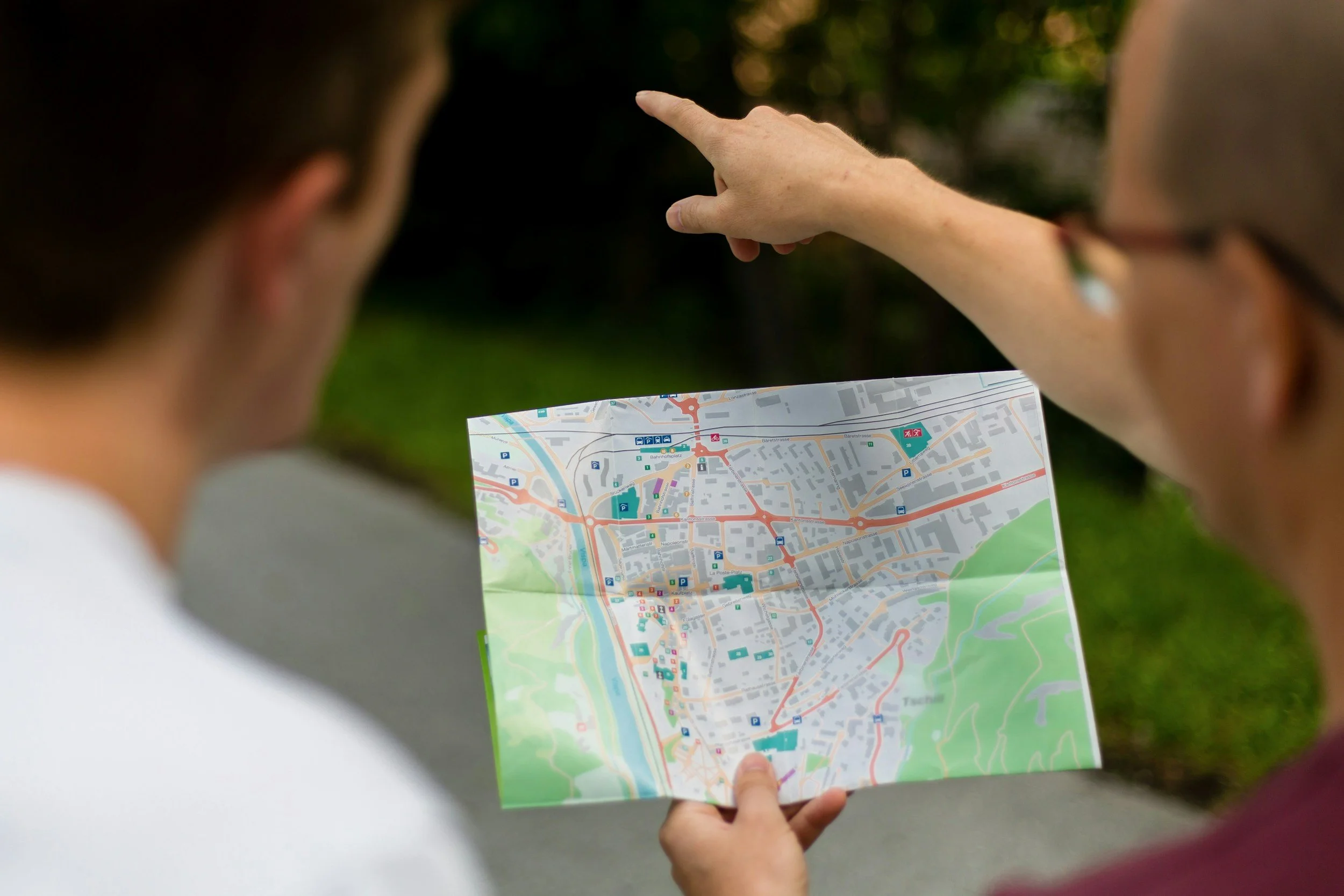
Trouble Way-finding: Visitors don't always know where they are
Visitors are not always clear where they are at any given time. For example, they will be on an educate page but think they are on a product/sales page
Visitors are going back to the homepage to reorient themselves every time they want to switch to another line of business
-

Explore & Take Action: Visitors are researching or ready to take action
Visitors doing research come to the site for the most up-to-date product details while they read review websites
Explorers comparison shop and look for "real numbers" like fees and rates
Action-takers are done researching and come to the site to apply and take the next step

Research Recommendations
Give visitors instant access to calls to action (CTAs)
Visitors need instant access to find and apply for product offerings, such as credit cards and mortgages
Often, visitors are on the site after researching extensively on their own. Therefore they are ready for action by the time they make it to the site
Create an experience that supports comparison shopping and research
Details and comprehensive information about products is vital to visitors
When they are in the research phase, they need detailed and in-depth specifics to help them compare and make informed decisions